Project story / Motion graphics
Make it move.
Typography with somewhere to go.
Kinetic type studies that used pace, scale, distortion, and repetition to make simple words feel active, expressive, and impossible to ignore.
The ask
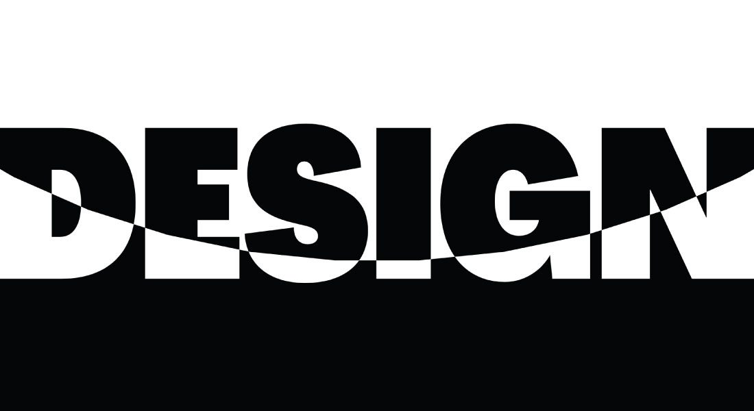
Make type do more than sit still.
Short loops needed to hold attention, communicate quickly, and still feel carefully designed at every stopped frame.
The big idea
Let the letterforms perform.
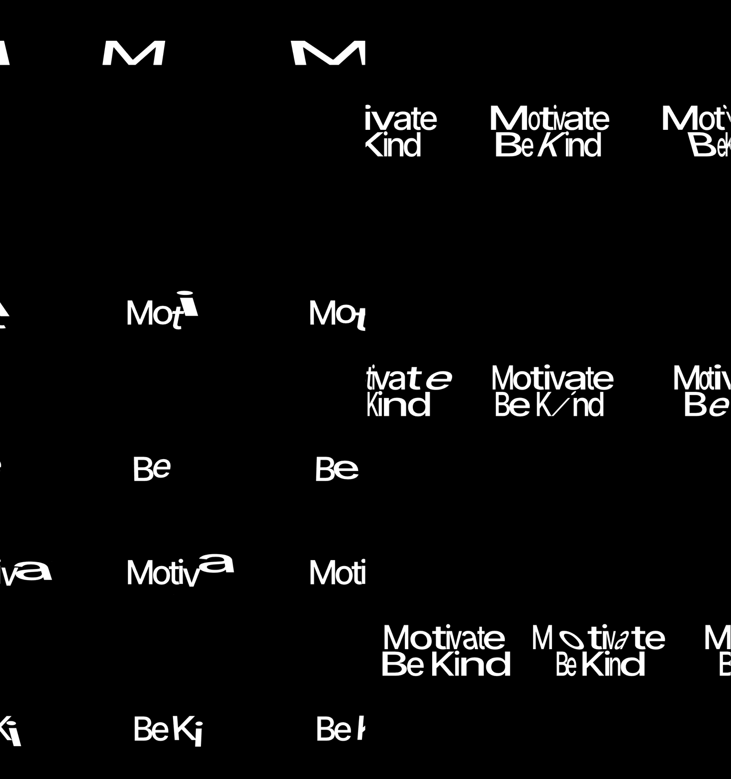
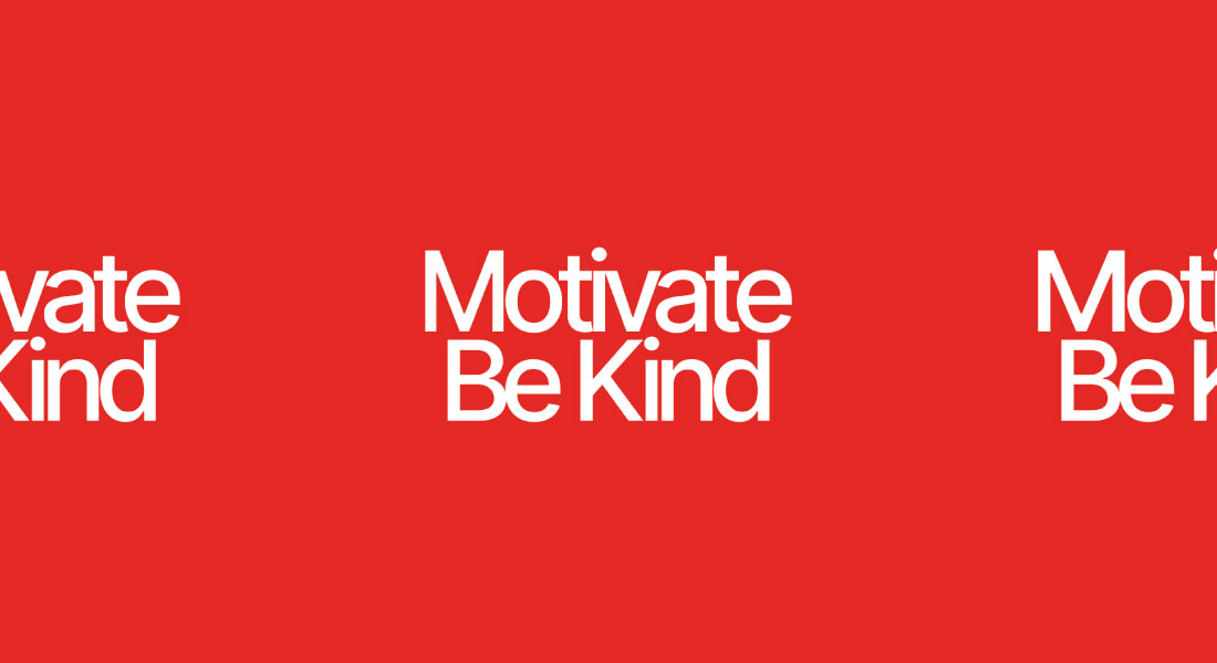
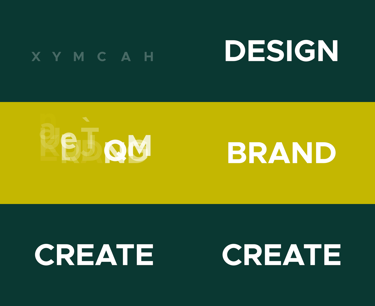
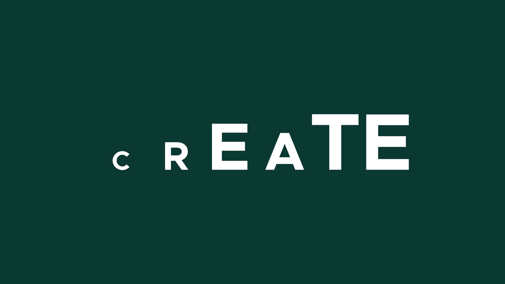
The words became the action—stretching, shifting, splitting, repeating, and snapping back into place to create rhythm without relying on extra imagery.
Type in motion
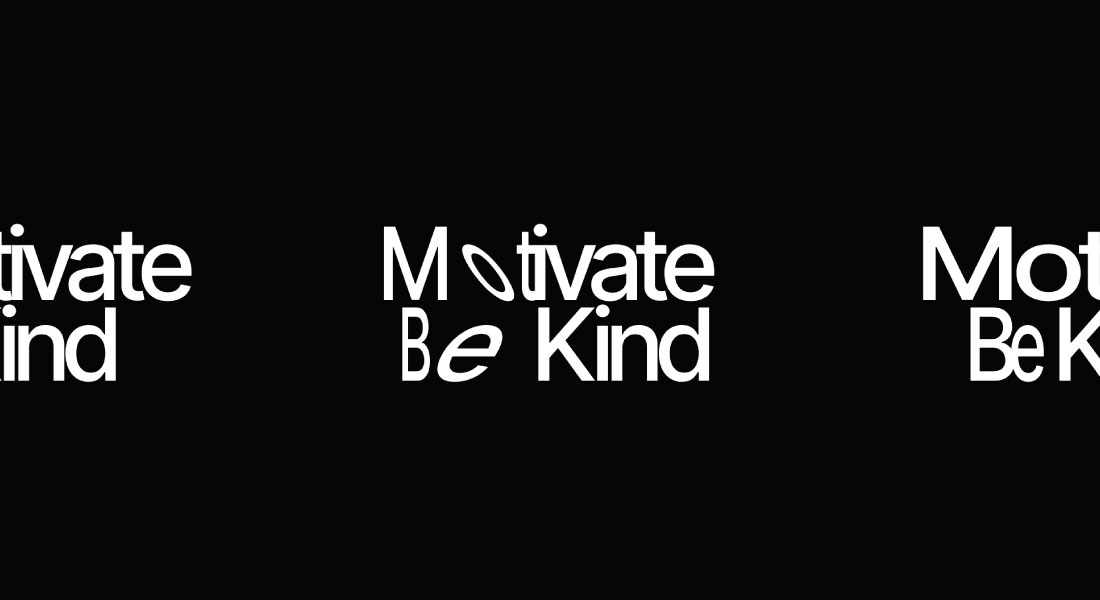
One phrase. A hundred little moves.
The motion stayed rooted in clear typographic ideas: contrast, hierarchy, tension, and release. Each loop could move fast while the message stayed legible.
Timing matters
Built frame by frame—and beat by beat.
A strong still composition came first. Timing, easing, repetition, and the return to frame one turned that composition into a loop that felt natural instead of mechanical.
- 01Start with a readable typographic lockup.
- 02Use scale and distortion to create the performance.
- 03Finish on a seamless loop that rewards another look.
The final result
Motion that lands the message.
The finished studies gave ordinary words a visual pulse—compact enough for digital placements, bold enough to hold a screen, and clear enough to communicate in a glance.
Keep wandering